Question One: In what ways does your media products use, develop or challenge forms and conventions of real media?
· Codes are visual or audio elements that the audience can see or hear.
· Conventions are stereotypes that the audience expects from characters in a particular genre; in our case this is Arthouse.
· Form is a basic structure of media text includes, camera, sound, editing, mise en scene; and our structure is a teaser trailer, magazine cover and a poster.
Our teaser trailer used these different elements from other Arthouse films:
Visual Elements
· Birds eye view shot and the spilt screen from Requiem of a Dream; which shows contrast between the characters. Also, the extreme close up of the eye changing pupil size is also from Requiem of a Dream.
· The canted angle from Donnie Darko
· Graffiti as a background from Volver.
· Sepia tones from Amelie and Delicatessen
· The Brighton beach long shot was used to show the location and connection between the characters.
Audio Elements
· From our sound research we discovered that most Arthouse films use string instruments as the soundtrack. Therefore our soundtrack was a guitar which emphasised the warm feeling. The rhythm builds up to create enigma and then fades out.
· We used the Spanish language as an inspiration from Pedro Almodovar films.
Conventions
· Our storyline contains untouchable taboo like events in childhood for example rape. We got the idea from Pedro Almodovar’s films.
· Strong contrast between and within the characters, which applies to most Arthouse films.
· Romance and drama
Forms
· Split screen, canted angle
· Sepia tones, luminance and channel map (overlay between shots)
· Backgrounds, costume, make up and prop
Developed and Challenged
Visual and Audio
· Subtitles in different places on screen
· Jump cut
· Reverse shot
· Jaw harp
· Typography in titles – got from dafont.com
Conventions
· Superstition; mirror smash, black cat instead of normal cat
· Bubbles – childhood memoir
Question Two: How effective is the combination of your main product and ancillary texts?
· The cat logo was used on our poster and the cat was mentioned in the trailer and appeared on screen too.
· Colour – sepia tones are featured in our magazine cover, poster and trailer.
· Two shots – suggesting the main characters of the storyline.
· Lighting – used in all of our products.
· Setting – warm feel. Graffiti was used in the trailer and magazine cover background.
· Typography – unique font in our products link together.
· Costume – complimentary colours.
Question Three: What have you learned from your audience feedback?
· From the audience feedback, we improved the storyline as we changed the order of shot, to create enigma.
· We received comments about the level of background noise which we were unable to change.
· Addition of the black cat at the end of our trailer to create quirkiness and to connect to superstition.
· Changed the font in the trailer to suit our genre of Arthouse.
· We cropped the edge of our production company animation to make it less jumpy.
· We developed our magazine cover, we changed the background, and the typography to suit the magazine we chose Little White Lies.
· Pearl and Dean – looked at the comparable profiles for Amelie and Donnie Darko to have an idea of the structure of the audience.
· We are aware that our audience is an older generation.
Friday 7 May 2010
Creating our film poster
When creating our poster for our film, we used a two shot of the main chracters and again changed the tones to be like sepia and very contrasting to keep our trailer and poster connected. This helps keep in sync with our genre of Arthouse. We also used the same font as our trailer again to keep the connection. We made our poster look professional by adding the detail at the top including the directors name and writer etc. We kept our poster quite simple and just had the date it was out; we also added some logos at the bottom of it as our sponsors, including Film4, Festival de Cannes and our production company logo Gonzo the cat. This adds a personal twist and makes our poster look professional.
Below is our final design.
Below is our final design.

Additin of Gonzo

We got suggested that adding a black cat into our trailer would have a quite quirky and dramatic effect. That’s because in the trailer the character Iva mentions black cats and superstitions. Coincidentally I happen to have a black cat at home, called Gonzo, so I filmed him walking across the screen and we edited him into the end of our trailer and added a motion blur on top so it looks a bit unreal and dreamy.It worked and looked well and this is how Gonzales became a superstar.
Creating the Magazine cover

First we started creating a magazine cover everyone else is doing. A total film magazine cover with a realistic whole body shot of our main characters. Than we realized that our kind of art house film would not be on a film magazine cover, which is based on Hollywood blockbusters.

This is why we decided to use one our our really strong close up photo as a main image on the magazine cover of little white lies, which is an independent magazine focusing on quirky, art house films. We used Photoshop filters to create a not realistic high contrast cartoon style picture. We choose the colour brown because we often used sepia in our film, and it would be something to connect the poster with the film. We used a nicely contrasting blue background, we overlaid the Spanish flag's logo in the background to add something that relates to Spanish but it didn’t work well.

After we changed the background colour to something warmer to suggest a romantic story, and we got the sunrise effect idea from other covers of Little White Lies. Than the complementary colours of green titles were added, but it just still was not right and also the sunrise effect didn’t fit with our story.

This one is the final magazine cover. The background is purple which is between the warm reddish and contrasting blue. There is a part of graffiti in the background to relate to our shots in the trailer. The main picture colour is changed to black to emphasize it and give it more characteristic, so the background doesn’t take off the eyes of the actors. The title 'The Desire Issue' matches the colour of the background and has a quite quirky font. The smaller titles are white so they stand out and they are easy to read. I think we did a good, developed job on this magazine cover and it fits in with the style of 'Little White Lies'. Maybe the background should be paler and a little gentler, but we tried playing around with different colours, intensity and saturation, but this looked the best.
Little White Lies Research


We looked at the magazine 'Little White Lies', as it was quirky and we liked the idea of an extreme bold magazine cover. This independent film magazine is also specialised for arthouse genre films. The signature of this magazine is the white stamp with the title of the magazine along with the title and price of the magazine. The magazine specialises in a particular film and the magazine is based around that issue. Also the magazine has won awards for graphic design and the magazine is so bold and stands out on the shelves. That is what we want our magazine to do. All covers and actually the whole magazine is beautifully designed and requires highly photoshop skilled designers to create it. We decided to create our magazine cover up to this standard. We need to use sharp contrasting colours, photoshop manipulations and quirky fonts. We chose this magazine due to the types of films it specialises in, to start of with, we used the Total Film magazine,but it didn't suit our genre; so we therefore switched to this one.
Title of our film
Desire.
We thought of the title 'Desire' as it carries connotations of passion and love .On the other hand, it is wanted by so many, yet not everyone can always have it. We thought this works for our teaser trailer as the two main characters, Iva and Adam, have a hidden secret. Their love and passion for each other is so strong, yet a childhood secret may deflect from their love.
We thought of the title 'Desire' as it carries connotations of passion and love .On the other hand, it is wanted by so many, yet not everyone can always have it. We thought this works for our teaser trailer as the two main characters, Iva and Adam, have a hidden secret. Their love and passion for each other is so strong, yet a childhood secret may deflect from their love.
Bibliography
http://en.wikipedia.org/wiki/Art_house
http://www.empireonline.com/
http://www.totalfilm.com/
http://www.dailymail.co.uk/home/index.html
http://www.guardian.co.uk/
http://www.timesonline.co.uk/tol/news/
http://www.dafont.com/
http://images.google.com/images?hl=en&client=firefox-a&rls=org.mozilla:hu:official&hs=faQ&resnum=0&q=art%20house%20films&um=1&ie=UTF-8&sa=N&tab=wi
http://www.drafthouse.com/winchester/admin/Images/new-moon-poster2-692x1024.jpg
http://www.igadgetlife.com/wp-content/uploads/2007/04/total_film_cover.jpg
http://en.wikipedia.org/wiki/Donnie_Darko
These are the links from where we collected our information or pictures for our research.
Colour corrections
Using Photoshop I did some colour corrections and effects on our best photos, just to get me started with the editing and putting together a final design solution. I played around with the brightness/contrast to create great contrast we were talking about earlier. I also desaturated some photos or used treshold to make it unique and cropped unnecessary bit out. I kept it all simple and natural.


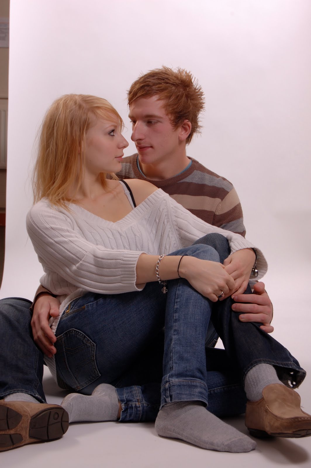
The Photo shoot
We used a studio in college and used one of the photography teachers to help take our photographs. Lucy was the creative director, and our actors, Viki and Josh were our models.
Viki was very photogenic, and we got some great shots of her alone. The images themselves were powerful, yet romantic to suit our genre. The chemistry between the two was really good. We looked at previous photographs to try and get ideas for ours. We used different angles, poses and focuses during the shoot. Also, Josh and Viki had different costumes for some of the photographs, so the portrayal of their character varied. We also paid close attention to little detail, such as Viki's jewellery, of a little black cat as her earring. The shoot took nearly two hours, but we had good results. We took roughly 200 photos, and we have narrowed it down to about 30. We need to pick different images, one for the poster, and one for our magazine cover. We may make a collage of the different photographs to make one or the other.
Here are ten of our best photographs.


Poster research
I researched lots of different style posters for inspiration and also as a template to look at how to create a good and interesting designs for film posters. These are examples of the very best ones.


 This poster I chose to talk a bit about because it is recent, it has a two shot on it and it also suggests something of the film. The features suggesting some kind of a reverse thing is the main title written as a backwards mirror image. The facial expressions are also very interesting. There are a bit of warm colour to it on a block black background.


The poster for the film called blow up on the left is very-very power full, because of the block red background. There is very quirky also disgusting black and white photo on it. The black and white and red creates a good contrast between the red which is the first thing to get the audiences attention and it still doesn’t take your eyes off the main grotesque picture of a photographer sitting on a dead women to get a good angled shoot.
I liked this poster because of the idea of the montage on it. Black and white shoots of the film are used with some black blocks to create a silhouette of a man with a gun. The title stands out because half of it is red and because of the size.

Very famous image of the poster of "the Silence of the lambs" There is close up of the main character with high exposure light and high contrast, the eyes and the butterfly kind of bug stand out of it, because of the colours. It also has a contrast between that the eyes suggest that the person is open and want to tell something, but she can not.

This is an award wining poster of the film 'Full metal jacket'. There is a very strong message shown using only simple things and clever combinations. That is the camouflage soldier hat and the words born to kill writen on it giving a horrible meaning to the picture, and than the white peace simbol as contrast next to it, suggesting that not even 'the soldiers who where born to kill' want war.
 This poster I chose to talk a bit about because it is recent, it has a two shot on it and it also suggests something of the film. The features suggesting some kind of a reverse thing is the main title written as a backwards mirror image. The facial expressions are also very interesting. There are a bit of warm colour to it on a block black background.


For the film 'Spirit' they created a series of posters several main ones, but i chose the first one because it has all the characters on it. The others show the women around the main character in the film and they give a hint of their personality by having a line of theirs from the film, on their face. The colours suggest the colours of the film, which is similar to the ones in sin city as they were both created by Frank Miller. They created interesting lighting and contrast. The title stands out everywhere because of the bright red colour.
Overall I think the possibilities and creativity behind creating a film poster is endless and only limited by the content of the film. I choose these particular ones to show a range of different styles and approaches.


Titles
We made our titles in Livetype and then transferred them into Final Cut HD. We played around with the fonts and colours and shadowing. When we wacthed back our trailer with the original font, it didn't seem to fit with our genre of film; so when changed them and they work alot better now. The font is called Jellyka Castle's Queen (from dafont.com) , and our titles has with a bold black background, we used white typography with a red outline. The titles do not move across the screen, when we added an effect it didn't seem to match our genre, so we thought it would be best for it to just fade in on the screen. It is immediate and stands out. Our original Titles had a voice over, but it did not sound good and when we changed to content, we decided not to use it. We thought this font suited our film the best because of the quirkyness. It stands out against a dark background with a bold coloured outline it looks very effective.


Photo shoot
We decided that for our film and poster we will not have images cut out from our trailer, we will organize a photo shoot. We will have access to a studio with lights and a high quality camera to achieve good resolution pictures, a plain background so it leaves us the creativity to design a background using Photoshop as we are both comfortable using it, from our graphics background.
The idea came from our previous magazine cover and poster researches, that usually they have separate pictures for them and not images from the film. We also looked at pictures with two shoots of couples on it, to get some inspiration for how to pose our models.
The clothes and makeup will be similar to the ones we mentioned
 before and
  used during filming.

The idea came from our previous magazine cover and poster researches, that usually they have separate pictures for them and not images from the film. We also looked at pictures with two shoots of couples on it, to get some inspiration for how to pose our models.
The clothes and makeup will be similar to
 the ones we mentioned
 before and
  used during filming.

Font research
We researched different fonts from dafont.com for out poster and magazine cover. Unfortunately for the magazine cover one our hand are a bit tied, because most real magazine covers have plain, simple san-serif fonts. We could try to make it fancier but should really try to keep it simple, at least we will use colours to highlight things and that will make it look more interesting. Although with the poster we have all freedom to play around with different fonts so here are some examples of the ones we like the most the only thing we need to be considering is that it’s legible and works from a distance.
 We like this font but it is quite hard to read, and as we have got Graffiti as a background in on of our shots, it would seem to much and over the top.

 This font is quirky, and with the white fill it looks effective and like it has been scratched into a surface.

 These cracked fonts are effective, yet we think that the mood it creates shows anger.


Some of these fonts are a bit too fancy and strong so it would not really go with the mood we try to create and this is the reason why i think they would work well, it would create a huge and powerfull contrast. Some of them are more plain, we could use on the magazine cover.
Subscribe to:
Posts (Atom)